Prototyping in low(ish) fidelity
More realistic than a wireframe and faster than polished designs; low(ish) fidelity design is often the sweet spot for prototyping and user testing and a great place to begin designing.
But what's wrong with regular wireframes?
Wireframes are unsuitable for user testing prototypes
Filled with dummy copy, unrealistic hierarchy and placeholder content; it’s impossible to perform realistic user testing with low fidelity wireframes. This often leads to starting again with another prototype for user testing or delaying testing all together until later in the design process when it’s more costly and time consuming to implement changes.
Wireframes waste effort when moving to high fidelity designs
Typically, wireframes are thrown out once completed and high fidelity designs begin on a blank canvas. This leads to a lot of wasted time re-entering content and modifying content and hierarchy structures at the beginning of the high fidelity design process.
So what is low(ish) fidelity design?
Real grids, breakpoints, and hierarchy
It all starts with a realistic mobile first template that features a proper grid, device breakpoints, and a simple typographic hierarchy. Beginning work like this forces designers to consider content structure and legibility from the very start.
Real content
At the very least, real content needs to be written or reused from an existing source for navigation, titles, headings and calls to action. Ideally body copy would also be realistic, but a little Lorem ipsum is allowable to keep things moving.
Strictly limited styling
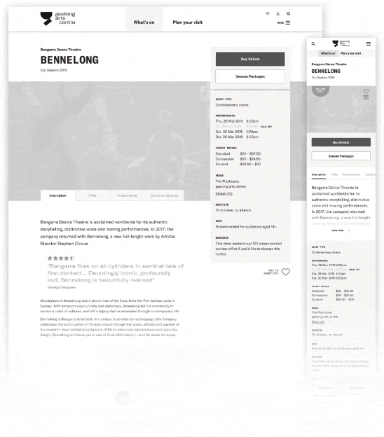
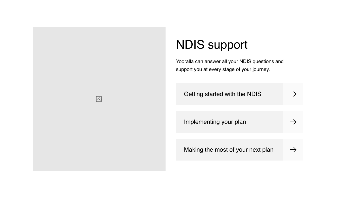
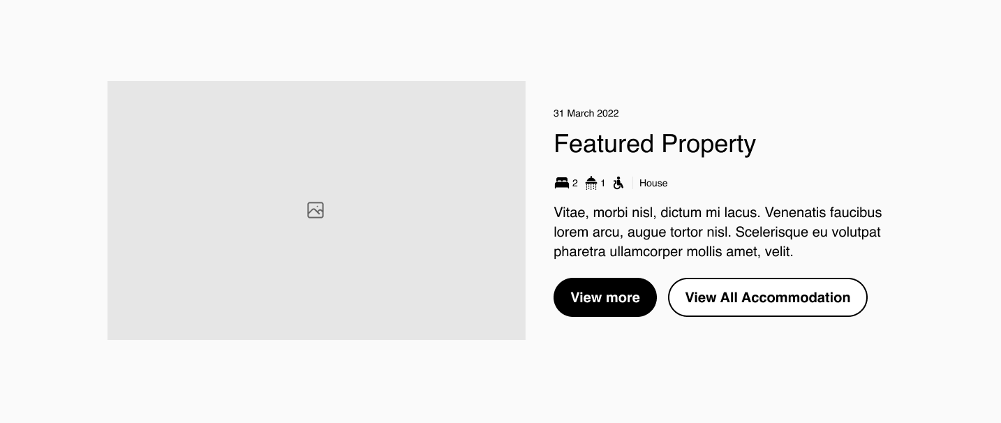
It’s important to avoid getting bogged down in the details during prototyping and the biggest danger is beginning to style too early in the process. This means you need strict limits on styling for colour, typography and very limited use of imagery. This often means a monochrome colour palette, limited use of one or two typefaces/weights, and a small number of hero images (desaturated in colour) when strictly necessary to communicate something important to users.
Building a low(ish) fidelity template
The key to working efficiently in low(ish) fidelity is starting with an existing template. We built one at Liquorice for marketing websites that we call the Cookie Cutter. It contains all the common elements for designing a marketing site; including an elegant typographic hierarchy, most common page types, multiple navigation options, and an extensive library of components.
It’s an extremely efficient way to work — often a full website can be roughly wireframed within a day and built out to low(ish) fidelity with real content and custom project specific components within two or three days. This means that you’re ready for stakeholder feedback really quickly, and can focus this process on providing more realistic content.
Creating a user testing prototype
After implementing feedback a testing prototype is produced by simply adding further content to the pages involved in the main user journeys. This typically means adding in more body copy, headings and calls to action so users can realistically find the content they are looking for during testing. The use of more full colour images can also be helpful to make the prototype feel more realistic for users.
An unexpected bonus: Testing a new brand
Maybe it’s just my bad luck but it’s always seemed pretty common for one team to be designing a digital project while a second team works on a simultaneous rebrand. Working in low(ish) fidelity provides a great opportunity to test a new brand before it’s finished — we commonly will take early concept logos and typography and add them to early prototypes. This can assist both teams to make quick decisions and provides a valuable opportunity to give the brand team feedback on logos, typography and colour contrast for accessibility before things are finalised.
Blurring the line between low and high fidelity
The final benefit to working in low(ish) fidelity is that the design process becomes more iterative as detail is progressively added. You never throw out your work and start again; the designs simply become more detailed and realistic over time. This means that you can present polished high fidelity designs for one page or feature without it looking out of place alongside other low(ish) fidelity work. The progessive enhancement process also allows user testing work to continue before high fidelity designs are completed.
We've had great success using low(ish) fidelity design for most of our projects at Liquorice; it's made for a more efficient design process and simplified the production and maintenance of prototypes for user testing.